PROJECT SUMMARY
Supra is a technological platform that makes international payments a reality in a fast and secure way, with competitive rates and costs that do not depend exclusively on a bank.


How was our story created?
Supra came to FT Media seeking to create a differential value in the platform, highlighting its digitalization and, in turn, the value of connecting business and international transactions in a fast way.


What was the result?
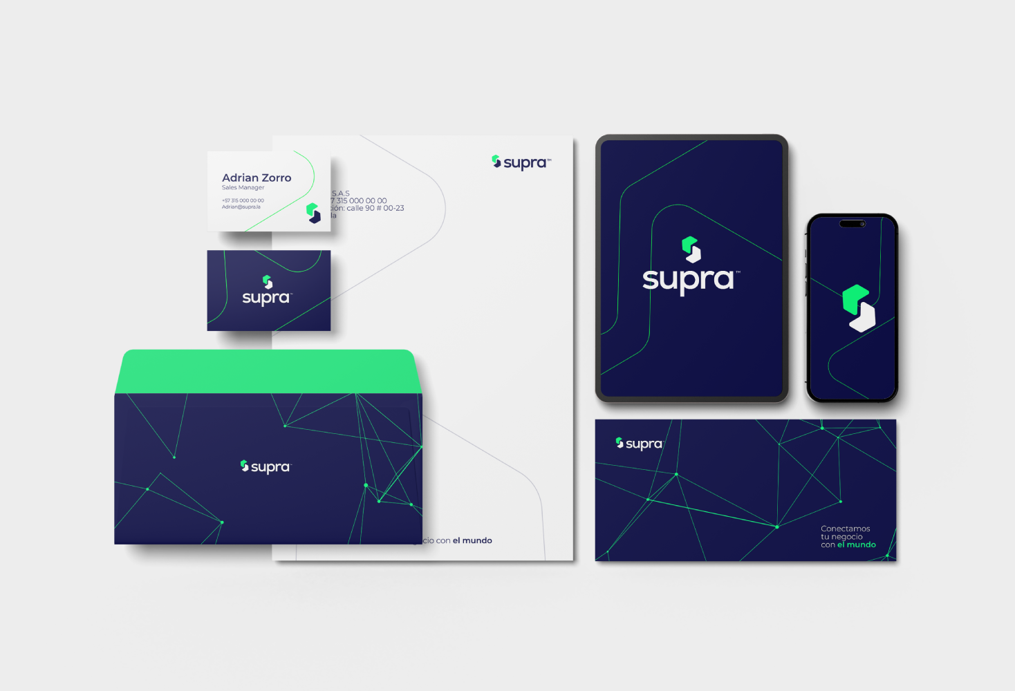
We built a differential brand in the market, evoking trust and modernity, but above all highlighting its brand values. We started with two basic colors: blue, which symbolizes trust and the security that Supra offers, and green, which represents agility and innovation in the platform.
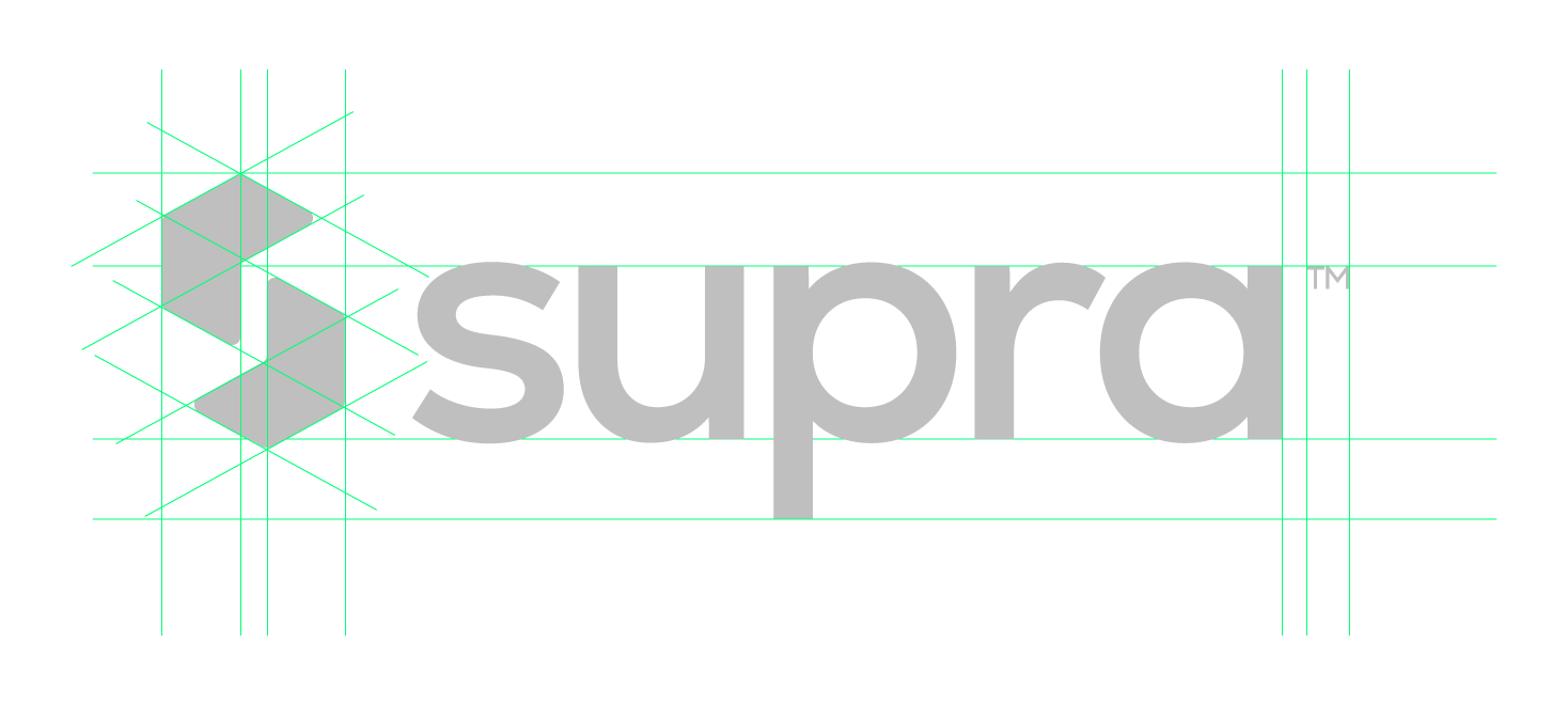
The SUPRA logo combines elements that suggest connection and movement, conveying the idea of fluid and fast transactions. The curved and dynamic lines in the logo design evoke the idea of constant movement, highlighting the speed and efficiency of the transactions offered by the platform. The chosen typography is modern and legible, conveying professionalism and confidence.


